I made this by animation on Photoshop by changing the DPI to 72 and exporting this Photoshop document to render video and then making it a quick time movie. First, I took nineteen pictures of various clocks in motion at different times of the day. Then I opened each photo into a Photoshop document and changed the background layer to layer 0. I deleted the pixels that I didn't need by using the polygon lasso tool, rectangular and circular tools, and also the eraser. When I was done with the deleting the extra pixels, I duplicated the layer into a new document. These documents consisted of 2500 by 2500 pixels, 300 DPI, and gray scale. Then I selected all and went to edit and hit the define paint brush. Next, I opened a new document on U.S. paper that was 11 x 8.5 on RGB. I started on my first layer using one color and only one paintbrush. This painting is using the neighboring colors of blue and green, but with a wide variety of different tones between these two colors. Some layers varied between light and dark and also being completely covered to only having one stamp. I made an extra layer for the title, "Tik Tok Around the Clock." When I was done with all twenty layers, I arranged the different layers until I was satisfied with this image. I arranged this image this way so that people could see the various clocks that I used. I am controlling the viewer's eye by using contrasting colors next to one another that make them stick out more especially with the white and black objects. This is an animation of various still clocks. The title of my animation is "Tik Tok" because the term tick tock represents a clock in motion whereas I only have still pictures of clocks. This helps give more insight to the animation that these were all pictures of clocks that were in motion as one point in time. Each clock has a different time on it that represents the clock "tick tocking away."
Monday, May 2, 2011
Tuesday, April 26, 2011
Week 15: Final Bike Lakeview Lamp Post
I made this entire image on Photoshop with the help of images on the internet. I remade this lamp post image using the same tools, but just fixing a few things. First, I had to add "Bike Lakeview" on the bottom of the canvas to tie everything together. I made this title in white to stand out more and contrast against the background colors. Then I had to fix the font on the Chicago Park District signs by making the font clearer and less filling. Next, I had to delete majority of the sailboats because the viewer's eye were being drawn to the many sailboats instead of the bike path and the bikes. Also, I had to delete a few of my bikes on the bike path and make it less cluttered. I arranged this canvas this way to make it simpler by deleting a few of the repeated objects. I arranged the painting this way so that people could see the bike path going through all of the sub neighborhoods of Lakeview next to the lake. I am controlling the viewer’s eye by using contrasting colors next to one another especially with the black objects. I am trying to accomplish the title, “Bike Lakeview,” for the lamp post canvas for the neighborhood of Lakeview in Chicago. This means you can express a whole neighborhood in this case Lakeview by pulling in different elements that represent a neighborhood. I'm trying to say to say you can express an idea by showing a scene from that neighborhood. I am trying to explain the slogan by pulling in the bike and bike paths with the lake on the side of it.
Week 14: Bike Lakeview Lamp Post

I made this entire image on Photoshop with the help of images on the internet. First I opened up a new document in Photoshop 180 x 24 inches, 150 DPI, and RGB. I decided to go with the real option meaning possible purchase along with being all original images. I opened a new layer and used the polygon lasso tool to make the bike path and used the paint bucket to color the path. Then I used the rectangular tool and made one of the yellow lines of the road. I duplicated the layer ten times and scattered the lines evenly throughout the bike path. I opened another layer and used the polygon lasso tool to make the left side of the image grass and the right the lake. I used the bike stand stamp from the last project to make a wave effect in the blue. I opened seven layers, and on each layer I used a different blue and scattered the bike stand stamp. Once I was done filling in all the spots with a different colored wave, I arranged the layers until I was satisfied with the lake. Then I opened up two more documents in Photoshop 8.5x 11 inches, 300 DPI, Grayscale. I made a bike and a sailboat on each document and selected all and defined both of them as a paint brush. I opened a new layer and stamped seven bikes going up and down the bike path. Then I stamped the sailboats all along the lake and made them various sizes. Next, I remade the Chicago Park District signs using the rectangular tool and the text box and put the five sub-neighborhoods: Wrigleyville, Lakeview East, Roscoe Village, Diversey Harbor, and Belmont Harbor on each sign. I arranged the painting this way so that people could see the bike path going through all of the sub neighborhoods of Lakeview next to the lake. I am controlling the viewer’s eye by using contrasting colors next to one another especially with the black objects. . I am trying to accomplish the title, “Bike Lakeview,” for the lamp post canvas for the neighborhood of Lakeview in Chicago. This means you can express a whole neighborhood in this case Lakeview by pulling in different elements that represent a neighborhood. I'm trying to say to say you can express an idea by showing a scene from that neighborhood. I am trying to explain the slogan by pulling in the bike and bike paths with the lake on the side of it.
Monday, April 11, 2011
Week 13: Final Bike Painting

I made this painting out of various photos that I took of different bike parts that I turned into paintbrushes. I remade my two bike paintings using the same bike paint brushes that I made. I had to fix the composition of the paintings and make one part stick out from the rest of the parts. I also had to include black and white in the paintings. First, I opened a new document on U.S. paper that was 11 x 8.5 on RGB. I started on my first layer using one color and only one paintbrush. This painting is using the neighboring colors of pink and purple, but with a wide variety of different tones between these two colors. Some layers varied between light and dark and also being completely covered to only having one stamp. I used my air cap to paint the entire layer black to use as the background color. I used my bike stand as a stamp and stamped the layer six times on the each side of the painting. When I was done with all ten layers, I arranged the different layers until I was satisfied with these two paintings. I arranged these two paintings this way too have the focus to be on the bike wheels in the first painting and the pedals in the second painting. I am controlling the viewers eye by making the bike wheel on the top layer be more dominant and bright. The wheel has more a contrast against the black background and sticks out more. For the second painting, I have the the pedals contrasting against the the bike reflectors and and the black background. The wheels and pedals stick out more because they are opposite colors compared to the colors in the background. These are two paintings that I made out of my own paintbrushes by using various parts of bikes. This means you can express an idea in this case a bike without using an actual bicycle. By using different parts helps get the idea that this painting is representing bicycles. I’m trying to say that by expressing a symbol by using various parts from the item can also get the point across.

I made these two paintings that are called "Birdie Love" and "White Christmas" out of the preset brushes on Photoshop. I remade these paintings to fix the composition of the last set of paintings and have one idea stand out more. I also had to include black and white into my paintings. First, I opened a new document on U.S. paper that was 11 x 8.5 on RGB. I started on my first layer using one color and only one paintbrush. This painting is using the neighboring colors of blue and green, but with a wide variety of different tones between these two colors.Some layers varied between light and dark and also being completely covered to only having one stamp. I used one paintbrush to paint the entire layer black making this layer the background layer. I added white swirls all over another layer to bring white into the painting and more contrast. I made the two birds and tree large and very dark to contrast from the background. When I was finished with all twenty layers, arranged the different layers until I was satisfied with these two paintings. In the "Birdie Love" painting, I arranged the layers so that the two love birds were more dominant and very large. compared to the other stamps. In the "White Christmas" painting, I arranged the layers so that the dark green tree would be more dominant and stick out more. I am controlling the viewers eye by making the birds and tree very dark contrast from the background. Also, I made them very large and in the center to attract more attention. These are two paintings that I made out of using other peoples paintbrushes. This means when you are finished with each layer can arrange the layers to make completely different paintings. The more layers you create with various differences from each layer can produce more interesting paintings. I'm trying to say that the more different paintings you can create from one set of layers, can help choose which is the best and worst painting.
Week 12: Bike Paint Brushes

I made this painting out of various photos that I took of different bike parts that I turned into paintbrushes. First, I went to Target and took ten pictures of various parts of a bike such as: pedals, handle bars, bike gears, a bell, a bike stand, wheels, a helmet, reflectors, a seat, and an air. Then I opened each photo into a Photoshop document and changed the background layer to layer 0. I deleted the pixels that I didn’t need by using the polygon lasso tool, rectangular and circular tools, and also the eraser. When I was done with the deleting the extra pixels, I duplicated the layer into a new document. These documents consisted of 2500 by 2500 pixels, 300 DPI, and gray scale. Then I selected all and went to edit and hit the define paint brush. When I did this to all nine photos, I then made my own paintbrush for the wheel of the bike. I used the rectangular and circular tool to make a bike wheel. I put each individual piece of the wheel on its own layer and then combined them all into one group. I selected the entire bike wheel and defined it into a paintbrush. Next, I opened a new document on U.S. paper that was 11 x 8.5 on RGB. I started on my first layer using one color and only one paintbrush. This painting is using the neighboring colors of pink and purple, but with a wide variety of different tones between these two colors. Some layers varied between light and dark and also being completely covered to only having one stamp. When I was done with all ten layers, I arranged the different layers until I was satisfied with these two paintings. I arranged these paintings this way so that people could see the different bike parts that I used. I am controlling the viewers eye by contrasting each part so that they stick out more. These are two paintings that I made out of my own paintbrushes by using various parts of bikes. This means you can express an idea in this case a bike without using an actual bicycle. By using different parts helps get the idea that this painting is representing bicycles. I’m trying to say that by expressing a symbol by using various parts from the item can also get the point across.
Week 11: Painting and Drawing

I made these two drawings out of using various sizes of circular black paintbrushes and viewing different tea pots in class.In the first painting, I opened a new Photoshop document and opened a new layer. I used a nine point round paintbrush and did only vertical lines. Then, I opened another layer to fill in the spaces drawing only horizontal lines. Next, I used red and yellow on a twenty point paintbrush and colored in the spaces of the tea pot. I rearranged the different layers until I was satisfied with this tea cup and turned off the layer that had the red lines. Then I began drawing the background of the tea pot and the tea pot stand. on different layers as well. I drew the computer behind the tea pot and as well as the keyboard. In the second painting, I opened up a new document on Photoshop and and opened a new layer. Then, I used a nine point paintbrush only doing vertical lines that created some what of the shape of the tea pot. Next, I opened up another layer and filled in the spaces using only horizontal lines. I arranged the different layers this way so that people can see the tea pot as a whole. I tried to fill in all of the spaces so that the tea pot looked like a solid item as it is in person. I am controlling the viewers eye by contrasting the yellow and the black in the first drawing. Also the tea pot is very dark and filled in compared to the other items I have in the drawing so this makes it stick out more. In the second drawing, I think I am controlling the viewers eye because of the contrast between the black tea pot and the white background. These are two drawings that I made out of Photoshop's round paintbrushes. This means that by drawing different directions of lines can

I made these paintings out of the various preset paintbrushes Photoshop offers. First, I opened a new Photoshop document on U.S. that was 8.5 x 11 on RGB. First, I decided on the two hues I would use which are green and blue. I started on my first layer using one color and only one paintbrush. This painting is using the neighboring colors of blue and green, but with a variety of different tones between these two colors. Some layers varied between light and dark and also being completely covered to only having one stamp. When I was done with all twenty layers, I rearranged they layers until I was satisfied with these five paintings. The first painting is called "Flower Power," second painting is called "Go Green," third painting is called "Jellyfish," fourth painting is called "Under the Sea," and the fifth painting is called "Bubble Burst." I arranged these paintings this way so that both the green and blue would show and contrast against each other. I am controlling the viewer's eye by putting the dark stamps against the light stamps and vice versa. I also tried to make everything be centered and draw the eye to the middle of the painting. These are two paintings that I made out of using other peoples paintbrushes. This means when you are finished with each layer can arrange the layers to make completely different paintings. The more layers you create with various differences from each layer can produce more interesting paintings. I'm trying to say that the more different paintings you can create from one set of layers, can help choose which is the best and worst painting.
Tuesday, March 22, 2011
Week 10: Final Digitally Produced Sketch

I made this entire image on Photoshop with the help of the images on the internet. My classmates had a problem with the first digitally produced sketch because it seemed that the people were leaving an older radio that seemed to be broken to attend a dance party. My classmates didn't like how the older radio was higher than the new radio and it seemed that the people were descending to a less important radio. Also they didn't like the fact that the new 88.3 radio was flat. First, I grabbed group one and positioned the new radio higher to look more important. I made the details of the radio stick out more by using bevel and emboss making the features on the radio more realistic. Then, I grabbed group two and brought the ordinary radio lower to look less important. Next, I recreated the bright red ladder to connect the new positioned radios together. Then, I recreated the music notes for the newer radio giving the notes more definition. I made smaller, flat music notes that are black and boring for the ordinary radio so that it didn't seem to be broken. I arranged things this way to make it seem like the stick people were leaving an ordinary radio and upgrading to an exciting new radio. I made the new radio look more realistic with features that stick out more. I am accomplishing the concept of the slogan "The Escape of Ordinary Radio" better in this is final image by rearranging a few details. I am able to explain the slogan in this image better because it shows the people leaving an ordinary radio too escape to the exciting 88.3. I am controlling the viewer's eye using a bright red for the color of the ladder that is contrasting to the other colors. This is a digitally produced sketch of people escaping to 88.3 from ordinary radio. I am trying to say that you can understand a concept of a slogan through images instead of words.
Week 9: Digitally Produced Sketch

I made this entire image on Photoshop with the help of images on the internet. First, I opened a new layer and made the new radio using the rectangular marquee tool. After I decided on the color of the radio I began to add the details to the radio. Each individual detail was its own layer so that I could move each item where it fit best. For the dial and the speakers, I used the circular marquee and once I made the shape I wanted I duplicated the layer to have a set of matching dials and speakers. When I was satisfied with the radio, I moved all the layers into group one so that I could move the radio all together. Then, I began to work on the older radio using the rectangular and circular marquee tool to get the perfect shape. I began to add the details of the older radio on its own layer so that I could move each individual item. I duplicated the speakers and the dials to get the exact same shape of each detail of the radio. When I was satisfied with the radio, I put all of the layers into group two. Next, I began to work on the ladder to connect each of the radios using the rectangular marquee tool. After making one step to fit inside the ladder, I duplicated the layer seven times to make seven matching steps. I put all of these layers into group three to be able to move the ladder as a whole. Then I began to create four different types of stick people: sitting down in two different ways, walking down the stairs, and dancing. I created these stick figures by using the circular marquee tool for theirs heads and the paintbrush for their bodies. Once I created one of each different bodies, I duplicated a few more to scatter them around the new radio and coming down the stairs. Last, I made the music notes by using the circular and rectangular marquee tool. Once I had the different shapes I was looking for I duplicated the layers and changed the colors. I arranged this image this way to accomplish the concept of the slogan "The Escape of Ordinary Radio." I arranged the stick people leaving the ordinary radio too escape to the exciting 88.3 radio. I am controlling the viewer's eye by using a bright red for the color of the ladder. This is a digitally produced sketch of people escaping to 88.3 from the ordinary radio. I am trying to say that you can understand a concept of a slogan through images instead of words.
Thursday, March 10, 2011
Special Edition: Modern Art


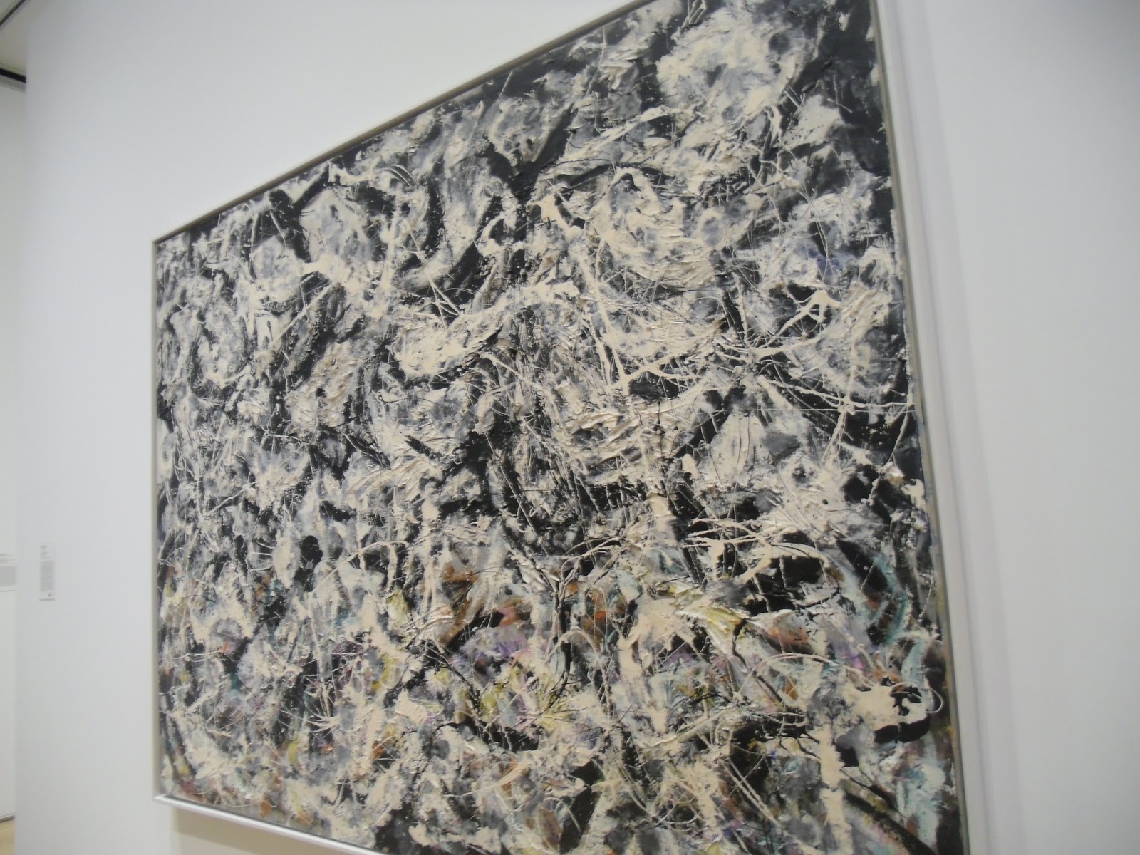
This painting is an oil on canvas and is called the "Greyed Rainbow" by Jackson Pollock. He made this by using a blank canvas and black and white paint. Pollock did this by putting his canvas on the floor or on a wall. He did a network of dripping, splattering, and painted lines with black and white paint. He used sticks, knives, and trowels instead of brushes to complete the process called action painting.

This painting is an oil on canvas and is called the "Volunteer" by James Rosenquist. This painting is of various images that highlight different aspects of American life. He arranges these different images this way showing the importance of these symbols of progress during that particular time period. Rosenquist used bright contrasting colors to depict each image from each other. Also, he puts images overlapping each other showing which one was more important in that American society at the time. He is controlling the viewer's eye by making the hand print larger which is dominating the rest of the images. Rosenguist traced his own hand to represent "the hand that volunteers."

This painting is an oil on canvas and is called "The Death of the Poet Walter Rheimer" by Conrad Felixmuller. This is Walter Rheimer who admitted to be addicted to cocaine and was sent off to war. His depression worsened and his life flipped upside down when his wife left him, he lost his artistic creativity, and became poor. When Rheimer came back from World War I, he found himself not able to keep up with the fast changing modern world. This painting shows Rheimer who appears to very elegant and satisfied about to jump out the window and take his own life. The expression on his face represents that this could be anyone in his shoes of suicide. Rheimer is trying to say that it is possible to capture a moment in a persons life and remembering the event in a positive way to learn from it.
Special Edition: Classical Art


This art piece is called the "Portrait of Philippe Coypel and His Wife" by Charles-Antoine Coypel. This piece is made of pastel colors and blue laid paper. First, Coypel created the two outsides frames on the border of the paper. He drew Philippe Coypel and then his wife in front of him to his right. Coypel made the lace of the women's sleeve very detailed to look almost real. Her lace and fan lay outside of the two outer frames. Once he was done with his artwork, this piece was placed together, laid down on a canvas and then stretched on a wood stretcher.

This painting is an oil piece on panel called "Life with a Flower Garland and a Curtain" by Adriaen van der Spelt and Frans van Mieris. Van der Spelt painted the flowers and Mieris completed the painting with the blue shimmering curtain. This painting is arranged this way to show that the painting is exquisite by having the curtain protecting it's beauty. Dutch collectors would use curtains to protect an exquisite painting which is what Mieris was trying to show. Mieris is controlling the viewer's eyes by painting this bright blue shimmering curtain over these dull flowers. He used his ability to fool the viewers eye to his own advantage.

These six panels of a series of paintings are called "The Capture of the Bandit El Maragato" by Francisco Jose de Goya y Lucientes. These are the six events in chronological order of how Pedro de Zaldivia, the humble monk, caught the Spanish bandit, El Maragato. First, El Maragato threatens Friar Pedro de Zaldivia with his gun. Then, Friar Pedro offers shoes to the bandit and begins to push the gun away. Next, the friar hits El Maragato with the end of the gun. Then, shoots the bandit and finally ties the bandit with a rope. This means to never underestimate anyone's ability, even a monk! Francisco Jose de Goya y Lucientes is trying to say that it is possible to capture human experiences and paint them in chronological order in a series of paintings.
Week 8: Final Sketches

I made these three sketches with a pencil, black pen, eraser, and five sheets of blank computer paper. First I drew all three sketches in pencil and retraced the images in pen. I erased all of the pencil markings to make the sketches clean and look sharp. The first sketch, I drew 96.3's ordinary music lines and 88.3's curvy music lines that has various notes and people listening to the station. I also drew a ladder that connects the two radio stations too represent the people escaping the ordinary radio to listen to 88.3. The second sketch, I drew 96.3's radio tower with very little signal in the distance and 88.3's large radio tower with a lot of signal. I drew a handful of people leaving the ordinary 88.3's radio station and heading to their escape of 88.3. The third sketch, I drew an ordinary ipod and a radio playing 88.3's radio station with music notes coming out of the speakers. I drew a ladder connecting these to items where people are escaping to 88.3's radio station. I arranged these sketches this way to show that people are escaping ordinary radio and going to the exciting 88.3 radio station. I am controlling the viewer's eye by making the people and music notes stick out more. I filled in the circles of the heads of the people and the music notes making these items very bold. These sketches are accomplishing the 88.3 slogan, "The escape from Ordinary Radio." These three sketches that show people leaving the ordinary radio behind and going to their escape, the 88.3 radio station. I am trying to say that you can explain a concept through images instead of words.
Wednesday, February 23, 2011
Week 7: Sketches
 |
I made these five sketches with a black pen and five sheets of white computer paper. The first sketch, I drew five thick black bars with a man pushing the bars out of the way to escape the music. I drew music notes in between each bar except where the man is escaping from. The second sketch, I drew a SXU radio on 88.3that has music notes coming out of both of the speakers. On the speaker on the right I have a man escaping out of the radio using a ladder. The third sketch, I have an old radio that is playing music from 88.3 and I showed this by drawing music notes coming out of the speakers. Also, I drew a man breaking free from a chain that was connected to the radio. On the fourth sketch, I drew a music line that had various music notes chasing a man who is trying to escape. On the fifth sketch, I drew a microphone that was on the air and sound coming out of it. Then I drew a man escaping the microphone using a knotted rope. I arranged each sketch to make sure that I was accomplishing the concept of the slogan "Escape from Ordinary Radio." I am conrolling the viewer's eye by contrasting lines by making items darker and filling in items with a black pen. These are five sketches of a man tring to run from ordinary radio. I am trying to say that you can explain a concept of a slogan through images instead of words. |
Monday, February 21, 2011
Week 6: Final Project

These collages are made out of onion rings and an eyeball. My classmates had a problem with the first set of collages because the human eye in the center didn't look realistic. When I selected the different hue colors on the three colored onion rings, the eyeball also turned a different color. First, I went back to my original cutout of the eyeball in the onion ring. I deleted the pixels that I wasn't using around the eyeball using the rectangular marquee, polygon lasso tool, and the eraser to get the perfect shape. I selected my final cutout and copied and pasted it in each collage. I put this layer first so that the eyeball cutout was in the front of the collage. For each collage I went to the drop down section and clicked on transform and then the scale tool. I had to play with the scale of each eyeball cutout for each collage because each collage had its own scale. Then I went back to all three collages and made each hue color brighter so it stood out more. I arranged the eyeball cutout this way to make the human eye look more realistic. I wanted the all the eyeballs to match and have all the characteristics of a real eyeball. I am controlling the viewers eye by positioning the eyeball layers on top of each of the onion rings in the center. The eye starts on each of the colored onion rings and keeps going inside each of various frames till the eye reaches the pupil. This is an eyeball inside an onion ring and it doesn't mean anything in particular. I am trying to say by making more than one cutout of an item can make the image look more realistic when playing with different hue colors.
Thursday, February 10, 2011
Week 5: Composition Focus

These collages are made out of an onion ring and an eyeball. First, I renamed the background layer to unlock the layer and to change the background color. Then, I copied and pasted one of my onion ring cutout in each of the three blank files I opened up in Photoshop. For each collage I went to the edit drop down section and clicked on transform and then the scale tool. For each cutout I would vary the size in each collage to have a variable. After I was satisfied with each different scale, I clicked the select all button and copied and pasted each cutout numerous a times until I was able to fill my page up. I lined the onion rings in a line of three making the middle line layer on top. I selected the center layer and clicked on image and saturation/hue where I changed the onion ring to three different hues. I arranged the onion rings this way to give the collages a dramatic effect. In all three of my collages I have constants and variable differences. I am controlling the viewer's eye by positioning the layers on top of each other so that the center layer looks the most important. This helps the eye to ignore the other onion rings because they look less important since they are farther back in the collage. The design consistencies that I have are location, size, saturation, and lines. In each collage, I have the same location which is positioned in the center and on the top layer. Even though the top layer looks larger, each onion ring in each collage also is the exact same size throughout the collage. The color saturation is also constant throughout these three collages staying at zero. Also, I positioned the onion rings in a set of three horizontal lines while making the middle section in front. The design variables that I have are scale, quantity, and hue. I enlarged the scale in the first collage, I used the original scale of the cutout in the second collage, and I reduced the scale in the third collage. I used different quantities of cutouts in each collage to be able to fill the pages with my dramatic design since I was working with three different scales. Each colored onion ring has a different hue level. The hue level is at zero in the first collage, a -80 level in the second collage, and a +180 level in the third collage.This is an eyeball inside of an onion ring and it does not mean anything otherwise. I am trying to say that these collages can all be of the same object and have many design consistencies, but yet are uniquely different by having their own variables.
Monday, January 31, 2011
Week 4: Craft Focus

This collage is made out of an onion ring and an eyeball. My classmates picked this object because it can be easily isolated. First, I opened this photo with Photoshop and highlighted the pixels that I wasn’t using. I used the rectangular marquee tool to delete large areas around the onion ring. I also used the polygon lasso tool to delete pixels around the onion that weren’t perfect shapes. Then, I used the eraser tool to get around the edges to make sure there weren’t any extra pixels I didn’t need. I selected my entire final cutout and copied and pasted it in a blank file in Photoshop. I renamed the background layer to change the color to a bright pink. After, I went into edit and clicked paste nine times. I played with each layer by putting them in the right order so that certain onion rings would stand out more. I brought the ninth layer to the front and changed the saturation to a bright blue. I arranged the onion rings this way so that the center would stand out the most. I am controlling the viewer’s eye by positioning the ninth layer in the center which stands out the most because the scale is bigger compared to the other objects. Also, I saturated the color which made this onion ring stand out over the other onion rings because of the contrast. This blue helps the blue eyeball also stick out more in the center of the onion ring. The other normal onion rings are further which makes them look less important. This helps the blue onion ring in the center stick out more because since the onion ring is repeated the others are ignored. This is an eyeball inside an onion ring and it does not mean anything in particular. I am trying to say by playing around with different tools such as size, color, and position helps an item stand out more.
Monday, January 24, 2011
Week 3: Re-shoot

I made this picture with two onion rings and a set of eyeballs. First, I picked out a handful of onion rings of all different sizes. I made sure that I had two onion rings around the same size. Second, I placed all the onion rings into a fryer to cook and when they were all done I let them sit to cool off. I placed the onion rings on a paper towel to let the grease soak up before I took any pictures. Next, I had my co-worker take two onion rings around the same size and place them up to her eyes to make glasses. Then, I made sure that the onion rings were in the center and were showing her eyes a certain way. I arranged the photo like this to show both of the whole eyeballs. I am controlling the viewer’s eye by starting with the outside of the onion ring and making its way towards the center of inside the eyeball. The eye goes from the outside frame to next inner frame and ends up in the pupil of the eye. This photo is of onion ring glasses. This means that you can use onion rings as fake glasses because they have holes for each eye to see out of. I’m trying to say that onion rings can represent something other than food when you become creative.

Wednesday, January 19, 2011
Week 2: Photos

I made this with vanilla, chocolate, and strawberry ice cream, chocolate syrup, fresh strawberries, a banana, whip cream, Nabisco cookies, chopped peanuts, and cherries. First, I sliced a banana in half and placed it into a banana split dish. I scooped three scoops of vanilla, chocolate, and strawberry ice cream each. I placed each flavor of ice cream beside each other in between the banana. Next, I poured fresh strawberries and chocolate syrup over the ice cream. Then, I topped the sundae with whip cream, chopped peanuts, three Nabisco cookies, and three cherries. I arranged the sundae this way because this how to make a proper Battleship sundae according to Lindy’s Chili & Gertie’s Ice Cream. I am controlling the viewer’s eye by placing the three bright red cherries at the top of the sundae. The eye quickly works its way down to the bottom of the sundae where the banana is located. This photo is of a Battleship sundae. This sundae received its name because it is in the shape of a battleship. It has three Nabisco cookies to represent the three towers you would find on this particular ship. I’m trying to say that a sundae can represent a real life object if one uses their imagination

Tuesday, January 11, 2011
Week 1: Introduction

Subscribe to:
Posts (Atom)